
These notes were prepared by Petros Komodromos.
Topics
In this last recitation more information is provided for Swing components.
1. The JComponent Class
Most Swing components that begin with J, except the top-level containers, are subclasses of the JComponent class. The letter J is used to differentiate the actual extra user interface classes provided by Swing from the support classes that it provides. Swing components inherit many features from the JComponent class, such as a configurable look and feel, borders, and tool tips, as well as many methods. In addition, some Swing components can display images on them. The JComponent class is the base class for almost all lightweight Jcomponents. The JComponent class extends the Container class (provides support for adding and laying out components), which in turn extends the Component class (provides support for painting, events, layout etc.). Therefore, all Swing J-components are AWT containers and inherit all methods from the Container and Component classes. Any instance of a JComponent subclass can contain both AWT and Swing components, since JComponent extends the java.awt.Container class.
The on-line JFC/Swing tutorial provides a summary of the following methods of the JComponent class:
- Customizing Component Appearance Methods Setting Component State Methods
- Handling Events Methods Painting Components Methods
- Dealing with the Containment Hierarchy Methods Laying Out Components Methods
- Getting Size and Position Information Methods Specifying Absolute Size and Position Methods
The JComponent class provides to its subclasses the following functionalities:
- Borders: Any instance of a JComponent subclass can be fitted in one of the several different border styles, such as custom, compound, etched, etc.
- Double buffering: Flickering is avoided by using an offscreen buffer (which is maintained by the RepaintManager) to update components before displaying them on screen.
- Graphics debugging support: Method setDebugGraphicsOptions() of the JComponent class facilitates debugging of graphics by slow motion painting with flushing before each graphics call and with optional diagnostic information.
- Autoscrolling: All JComponent subclasses can autoscroll, i.e. scroll their contents when the mouse is dragged outside their bounds. Autoscrolling is activated, or deactivated, using the method setAutoscrolls() of the JComponent class.
- Tooltips: Strings describing the functionality of a JComponent subclass object can be displayed above it, providing help to the user of the component, whenever the cursor rests over it based on timing characteristics specified by the ToolTipManager class. The method setToolTipText(String text) of the JComponent class is used to associate a tooltip with a Swing component.
- Keystroke handling support: Keystrokes can be specified for JComponent subclass objects, using the method registerKeyboardAction_(ActionListener anAction, String aCommand, KeyStroke aKeyStroke, int aCondition)._ Then, when the specified keystroke is typed, the specified ActionListener’s ActionPerformed() method is invoked if the conditions specified by the last parameter are satisfied.
- Focus management: Pressing the Tab-key in a Swing container, by default, moves focus to the next focusable component. Modifying the JComponent focus properties or replacing the default focus manager allows the modification of the default focus behavior.
- Improved layout support: the JComponent class add setter (and getter) methods to set (and get) some size requests to (from) the layout manager, such as the setPreferredSize(), setMinimumSize(), setMaximumSize(), setAlignmentX(), and setAlignmentY() methods.
- Pluggable look and feel: A corresponding, to each JComponent object, ComponentUI object performs all the drawing and event handling using the current look and feel, which can be set using the UIManager.setLookAndFeel() method.
- Accessibility support: Assistive technology is built into Swing components, enabling software accessibility to everyone, e.g. using magnifying fonts, audio look and feel alternative.
All lightweight Swing components extends the JComponent class, which keeps a reference to a corresponding component UI, or UI delegate. The name of a class delegate is derived from the name of the component by removing the J from the front and adding UI at the end. The UI delegate is responsible for the look and feel and the events handling of a Swing component, e.g. the delegate of the class JLabel is the LabelUI.
For the rendering of lightweight Swing components, the paint() method of the JComponent class is used. In particular, a Graphics object is passed to the paint() method in which it draws the component, the component’s border, and the component’s children in order. When the component has a UI delegate, the delegate’s paint() method is invoked, which clears the background in case of an opaque component, and, then, paints the component. For double buffered components it paints the component into an offscreen buffer and then copies it into the component’s onscreen area. Since double buffered is provided by Swing there is no need to override the paint() method, as it is for AWT to achieve avoid flickering. To redefine the way a component is painted the paintComponent() method of the JComponent class should be overwritten, which usually needs to invoke the super.paintComponent() method.
In contrast to AWT components, it is not necessary to override the update() method, which erases the background of a component and then invokes paint(), to avoid flickering. The JComponent class overrides the update() method invoking directly the paint() method, while the UI delegate is responsible for erasing the background. The flickering is avoided since double buffering is used by the Swing components, i.e. the components are repainted first in an offscreen buffer and, then, copied to the screen. Only JRootPane and Jpanel of the Swing lightweight components are by default double buffered. Components that reside in a double buffered container are automatically double buffered. The method setDoubleBuffered() of the JComponent class can be used to set whether the receiving component should use a buffer to paint. The offscreen buffer used for the double buffering can be obtained using the method RepaintManager.getOffscreenBuffer().
The validate() method of the Container class positions and sizes the components of a container. The revalidate() method of the JComponent class should be invoked by any Swing component that is modified in order to invalidate the component and then invoke the validate() method using the event dispatch thread, which result in the component to be positioned and sized properly. Sometimes, repaint() should also be called after invoking revalidate().
A Swing lightweight component can be opaque, i.e. its background is filled with the component’s background color, or partially transparent, i.e. has transparent background. Swing components are by default opaque, which can be changed using the setOpaque(false) method.
The Graphics subclasss DebugGraphics supports graphics debugging by slowing the rate of graphical operations and flushing prior to each operation. To use graphics debugging the setDebugGraphicsOptions() of the JComponent class should be invoked with one of the debugging options:
- DebugGraphics.LOG_OPTION: causes a text message to be printed.
- DebugGraphics.FLASH_OPTION: causes the drawing to flash several times.
- DebugGraphics.BUFFERED_OPTION: creates an ExternalWindow that displays the operations performed on the View’s offscreen buffer.
- DebugGraphics.NONE_OPTION: the graphics debugging feature is not used
2. Top-Level Containers
A GUI component must be part of a hierarchy with a top-level container as its root to be displayed onscreen. The top-level container classes provided by Swing are the following:
- JFrame: A top-level window with a title and a border.
- JDialog: The main class for creating a dialog window.
- JApplet: Enables applets to use Swing components.
- JWindow: A not, in general, useful window with no controls or title.
A standalone application with Swing components uses at least one containment hierarchy with a JFrame object as its root, while a Swing-based applet uses a containment hierarchy with a JApplet object at its root. Menu bars usually are added, using the setJMenuBar() method, only in frames (JFrame_)_ and in applets (JApplet_)_.
A top-level container has a content pane, which contains the visible components, and, optionally, a menu bar that is positioned within the top-level container, but outside the content pane. To add a component to a container the method getContentPane() can be used to obtain the content pane to which the component can be added using the add() method. The default content pane is a simple intermediate container that extends JComponent, and uses a BorderLayout as its layout manager. Adding/removing components, setting layout managers, adding borders, etc. are invoked on the content pane, which is a field of the JRootpane class. The getContentPane() method returns a Container object, not a JComponent object, which means that to be able to use the content pane’s JComponent features, either the return value must be typecast, or a (opaque) component to be the content pane must be created and used (using the setContentPane method()).
Frames: JFrame
A JFrame object is essentially a window with some additional decorations and functionalities, such as a title, a border, and closing and iconifying buttons.
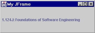
The following program creates a JFrame object that contains a JLabel object.
import java.awt.*;
import javax.swing.*;
import java.awt.event.*;
public class FrameApplication1
{
public static void main(String args[])
{
JFrame jfr = new JFrame(“My JFrame”);
jfr.addWindowListener(new WindowAdapter()
{
public void windowClosed(WindowEvent e)
{
System.exit(0);
}
} );
jfr.setBounds(100,100,800,200);
JLabel myLabel = new JLabel(" 1.124J: Foundations of Software Engineering “);
myLabel.setPreferredSize(new Dimension(300,80));
jfr.getContentPane().add(myLabel, BorderLayout.CENTER);
jfr.pack();
jfr.setVisible(true);
}
}
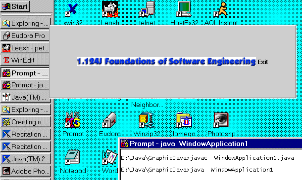
Executing the above Java® application (java FrameApplication1) opens the following window with its left top corner at the location (100,100):
Applets: JApplet
Any applet that contains Swing components must be implemented using the JApplet or any subclass of the JApplet class. Applets are typically loaded by web browsers based on references inserted in html files. Upon the creation of an applet, its init() method is called. An applet does not have a close button or a title bar. The browser calls the start() method after calling the init() method, but also every time the page that contains the applet is revisited. The size of an applet is determined by the browser (or the appletviewer) using the size request provided in the corresponding html file.
Each Swing applet has a root pane (JRootPane) which provides additional functionalities, such as support for a menu bar. Components should be added and layout managers should be set to the root pane and not the applet itself. The default layout manager for the content pane of a Swing applet is the BorderLayout, and not the FlowLayout, which is the default layout manager for AWT Applet.
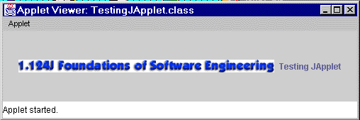
The following Java® source code demonstrates the use of JApplet to create the simplest possible applet. It is followed by the html file, which can be used to load the corresponding class file (TestingJApplet.class). Finally, a snapshot of the resulting window that appears, when the appletviewer is used to load the html file, is presented.
TestingJApplet.java
import java.awt.*;
import javax.swing.*;
public class TestingJApplet extends JApplet
{
public void init()
{
Icon icon = new ImageIcon(“1.124.gif”, “1.124 GIF”);
JLabel label = new JLabel(” Testing JApplet",
icon, SwingConstants.CENTER);
getContentPane().add(label);
}
}
TestingJApplet.html
<html>
<head>
<title>JApplet Testing # 1</title>
</head>
<body>
<center>
<h2>
<u>JApplet Example # 1</u></h2>
<hr><Applet code=“TestingJApplet.class” WIDTH=“500” HEIGHT=“100”></Applet>
<hr></center>
<p><br>
</body>
</html>
> appletviewer TestingJApplet.html
Dialogs: JDialog
Class JDialog extends the AWT Dialog class and implements the WindowConstants, Accessible, and RootPaneContainer interfaces. The JDialog class can be used to create a window that dependents on another window, e.g. to disappear/appear whenever the other window is iconified/deicognified, and has a border and a title bar. The JDialog class, which extends the Dialog class by adding a root pane and support for a default close operation, can be used to create a custom dialog. It is a heavyweight Swing container that contains a JRootPane instance to which components are added and layout managers are set.
To create a dialog using directly the JDialog class requires the creation and laying out of the components as well as creating of the buttons and listeners necessary to dismiss the dialog. The JDialog class has a JOptionPane child, which provides many static methods that can be used to create a variety of standard dialogs. A dialog provided by the JOptionPane is modal, i.e. when it is visible it blocks user input to all other windows in the program. The JDialog class must be used to create a non-modal dialog.
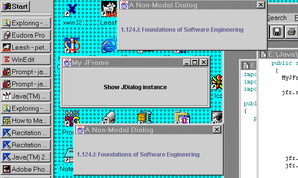
The following example is a Java® application which provides a button in a frame. Whenever the button is pushed a non-modal dialog is created as shown in the snapshot of the program execution, which follows the source code:
import java.awt.*;
import javax.swing.*;
import java.awt.event.*;
public class DialogApplication1
{
public static void main(String args[])
{
MyJFrame jfr = new MyJFrame(“My JFrame”);
jfr.addWindowListener(new WindowAdapter()
{
public void windowClosed(WindowEvent e)
{
System.out.println( “Exiting the program”);
System.exit(0);
}
} );
jfr.setBounds(100,100,800,200);
jfr.setDefaultCloseOperation(WindowConstants.DISPOSE_ON_CLOSE);
JButton myButton = new JButton(“Show JDialog instance”);
myButton.setPreferredSize(new Dimension(300,80));
myButton.addActionListener(jfr);
jfr.getContentPane().add(myButton, BorderLayout.CENTER);
jfr.pack();
jfr.setVisible(true);
}
}
class MyJFrame extends JFrame implements ActionListener
{
public MyJFrame(String title)
{
super(title);
}
public void actionPerformed(ActionEvent e)
{
if (e.getActionCommand().equals(“Show JDialog instance”))
{
System.out.println(“Button has been pushed causing " +
“the appearance of a JDialog”);
JDialog dialog = new JDialog(this, “A Non-Modal Dialog”);
JLabel myLabel = new JLabel(” 1.124J: Foundations of Software Engineering “);
myLabel.setPreferredSize(new Dimension(300,80));
dialog.getContentPane().add(myLabel, BorderLayout.CENTER);
dialog.pack();
dialog.setVisible(true);
}
}
}
Option panes are components that can be placed in dialox boxes. The JOptionPane class allows the creation and customization of several different kinds of dialogs, such as support for laying out standard dialogs, specifying the dialog’s title and text, providing icons, customizing the button text and the components the dialog displays, and specifying where the dialog should appear onscreen. Any one of four standard JOptionPane icons (which indicate question, information, warning, and error) can be displayed by the dialog.
The JOptionPane class allows the easy pop up of a standard dialog box, providing the following methods:
- showOptionDialog(): displays a customized dialog with a variety of buttons, or a collection of components, allowing a selection from a set of options
- showMessageDialog(): provides a simple message with a button to dismiss it,
- showConfirmDialog(): asks for the user’s confirmation providing a number of choices.
- showInputDialog: Shows a question-message dialog requesting input from the user.
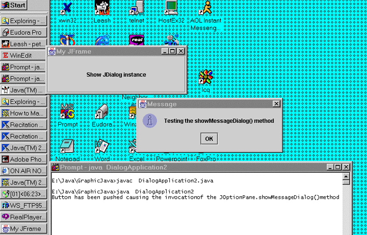
The Java® application with the following source code uses the showMessageDialog() method of the JOptionPane class to create a message dialog as it is shown in the snapshot following the source code:
import java.awt.*;
import javax.swing.*;
import java.awt.event.*;
public class DialogApplication2
{
public static void main(String args[])
{
MyJFrame jfr = new MyJFrame(“My JFrame”);
jfr.addWindowListener(new WindowAdapter()
{
public void windowClosed(WindowEvent e)
{
System.out.println( “Exiting the program”);
System.exit(0);
}
} );
jfr.setBounds(100,100,800,200);
jfr.setDefaultCloseOperation(WindowConstants.DISPOSE_ON_CLOSE);
JButton myButton = new JButton(“Show JDialog instance”);
myButton.setPreferredSize(new Dimension(300,80));
myButton.addActionListener(jfr);
jfr.getContentPane().add(myButton, BorderLayout.CENTER);
jfr.pack();
jfr.setVisible(true);
}
}
class MyJFrame extends JFrame implements ActionListener
{
public MyJFrame(String title)
{
super(title);
}
public void actionPerformed(ActionEvent e)
{
if (e.getActionCommand().equals(“Show JDialog instance”))
{
System.out.println(“Button has been pushed causing the invocation” +
“of the JOptionPane.showMessageDialog()method”);
JOptionPane.showMessageDialog(this, “Testing the showMessageDialog() method”);
}
}
}
The JFC/Swing Tutorial provided by Sun has a series of tables with details on the:
- “Showing” Standard Modal Dialogs Methods (using JOptionPane Class) Methods for Using JOptionPanes Directly
- Other JOptionPane Constructors and Methods Frequently Used JDialog Constructors and Methods
Windows: JWindow
JWindow, which extends AWT Window class, provides a window with no resizing controls, border, menu bar, or title that is always on top of every other window. A JWindow instance can be used to display something in a rectangular region (window) without any title or menus that appears on top of other components.
Although an instance of JWindow is a heavyweight component, i.e. it does not inherit capabilities of the JComponent class, it contains an instance of JRootPane, which can be manipulated as any other lightweight component. Actually the main difference of JWindow, from the AWT Window is that the former contains a root pane to which the components should be added and layout managers should be set.
The following program creates a JWindow instance with a JButton instance with an icon on it. When the mouse clicks on the button the actionPerformed() method is called and the program exits after a short message is printed.
import java.awt.*;
import javax.swing.*;
import java.awt.event.*;public class WindowApplication1
{
public static void main(String args[])
{
MyWindow window = new MyWindow();Icon icon = new ImageIcon(“1.124.gif”, “1.124 GIF”);
JButton myButton = new JButton(“Exit”, icon);
myButton.setPreferredSize(new Dimension(300,80));
myButton.addActionListener(window);
window.getContentPane().add(myButton);window.setBounds(100,50,500,150);
window.setVisible(true);
}}
class MyWindow extends JWindow implements ActionListener
{
public void actionPerformed(ActionEvent e)
{
if (e.getActionCommand().equals(“Exit”))
{
System.out.println( “Exiting the program”);
System.exit(0);
}
}
}
The execution of the above application gives a window that looks like the following:
3. Intermediate Swing Containers
Intermediate Swing components are non-top-level containers that are used to contain other components.
Panels: JPanel
A panel, which is implemented using the JPanel class, is the most frequently used intermediate container. The JPanel class extends the JComponent class, which provides among others double buffering support, and implements the Accessible interface. A JLabel object can display text, an image, or both, but it does not react to input events. Being able to be used as a general-purpose container for lightweight components, but also as a component (e.g. as a canvas) to which text and graphics can be rendered, it is, essentially, the successor of the AWT’s Panel and Canvas classes. A component can be made non-opaque (i.e. transparent) by invoking setOpaque(false) method. The default layout manager of a JPanel object is an instance of the FlowLayout class, which places the panel’s contents in a row. To add components to a panel, the add() method is used.
Example of JPanel
import javax.swing.*;
import java.awt.event.*;
public class MyJPanel extends JPanel
{
MyJPanel()
{
setBackground(Color.cyan);
setPreferredSize(new Dimension(200,200));
}
public void paintComponent(Graphics g)
{
super.paintComponent(g);
g.setColor(Color.red);
g.drawLine(100,100, 350,200);
g.setColor(Color.blue);
g.drawRect(200,50, 50, 20);
g.setColor(Color.black);
g.fillRect(20,150, 90, 150);
g.drawString(“Testing JPanel and Graphics”, 120, 250);
}
public static void main(String args[])
{
final JFrame jfr = new JFrame(“JPanel Example”);
JPanel panel = new MyJPanel();
jfr.getContentPane().add(panel, BorderLayout.CENTER);
jfr.setBounds(200,100,600,400);
jfr.setVisible(true);
jfr.setDefaultCloseOperation(JFrame.DISPOSE_ON_CLOSE);
jfr.addWindowListener(new WindowAdapter()
{
public void windowClosed(WindowEvent e)
{
System.exit(0);
}
} );
}
}
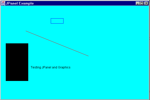
The above example, when executed, gives the following window:
Internal Frames: JInternalFrame
Internal frames are lightweight components to which heavyweight components should not be added. An internal frame is an instance of the JInternalFrame class that provides many of the features of a native frame, such as closing, iconification, title displaying, dragging, resizing, and menu-bar support. Typically, internal frames are contained in JDesktopPane instances.
Components are added and layout managers are set on the content pane of the JInternalFrame. An internal frame needs to be added to a container, since it is not a top-level container. As with a regular frame, the setVisible(true), or the show() method should be invoked on an internal frame to display it.
The size of an internal frame must be set, e.g. using any of the setSize(), pack(), or setBounds() methods, since by default has zero size being invisible. The location of an internal frame may need to be set, since the default is at (0,0), i.e. at the upper left of its container. JInternalFrame, or JOptionPane, should be used to implement Dialogs.
Internal frames can be used in combination with the JDesktopPane to implement Multiple Document Interface (MDI) applications, in which a window acts as a desktop for documents created in the application. Class JDesktopPane extends the JLayeredPane class and implements the Accessible interface. Desktop panes are intended to contain internal frames allowing the development of MDI applications. Desktop managers, which are instances of the DesktopManager, implement the look-and-feel-specific behavior of desktop panes.
Root Panes: JRootPane
A JRootPane is contained in all Swing top-level containers. It is a fundamental component in the container hierarchy, providing to the top-level (heavyweight) containers (JFrame, JDialog, JWindow, and JApplet) the JComponent’s capabilities. Not only these heavyweight, but also the lightweight container JInternalFrame, delegate their operations to a JRootPane instance, which is automatically created as soon as any of these containers is instantiated. Therefore, almost all Swing components reside in a JRootPane instance. The interface RootPaneContainer is implemented by components that have a single JRootPane child: JFrame, JDialog, JWindow, JApplet and JInternalFrame.
A root pane consists of the following components, as shown in the following figure (adapted from the Sun’s Java® Tutorial):
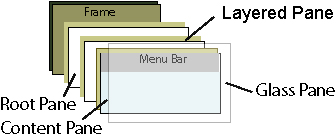
- Glass pane: The glass pane is the topmost component in a root pane. It is hidden, by default, unless it is made visible. It’s also completely transparent unless its paint() method is overwritten. The glass pane, when it is visible, can trap mouse events. If it expresses interest in handling mouse events, by adding a mouse listener or enabling mouse events, it blocks all input events from reaching the components in the content pane, since it is the topmost lightweight component in its container. The glass pane can also be used to paint over an area that already contains one or more components.
- Layered pane : The layered pane, which is underneath the glass pane, can be used to place components on separate layers. The layered pane serves to position its contents, and, optionally, in a specified z-order. A JLayeredPane allows to the components that it contains to be placed in specific layers with which the depth at which the components are displayed is controlled. Each layer is assigned a specific numerical value, which can be explicitly set using the setLayer() method of the JLayeredPane class. Also, the relative depth of a component with respect to other components on the same layer can be specified using the setPosition() method. Positions are specified using an integer between -1 and the number of components at that depth minus one. Overlapping components can appear one on top of the other, displaying the layers with higher values in front of those with lower values. JLayeredPane class specifies certain values to some specific layers, as described in the corresponding API documentation. It does not help to add a heavyweight component in a JLayeredPane, since a heavyweight component is always displayed above a lightweight component. A JLayeredPane instance contains, in turn, a content pane and an optional menu bar.
- Content pane: It is the container of the root pane’s visible components, it contains applet/application’s components.
- Optional menu bar: It is used for the root pane’s container’s menus.
The z-order of components is determined by the order with which they are added to their container. The first component added to a container is displayed on top of all other components.
The RootPaneContainer interface provides assessor methods for the JRootPane and its contents (glass, layered, and content pane and optional menu bar).
Scroll Panes: JScrollPane and JViewport
For scrolling Swing has two lightweight containers, the JScrollPane and the JViewport, one interface, named Scrollable, and one component named JScrollBar.
The JScrollPane is a container that can be used (instead of the AWT ScrollPane ) to display a component that is larger than the available display space. It extends the JComponent class and implements the ScrollPaneConstants, and Accessible interfaces. It contains a JViewport instance. It controls the latter as well as the optional vertical and horizontal scrollbars, and optional row and column header viewports. Using the scrollbars the viewport’s view and the row and column headers can be scrolled. There are, also, corner components, which are by default instances of JPanel with background color that of the scrollpane background.
The following figure (taken from the Java® 2 API) shows the JScrollPane components.
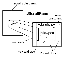
The JViewport is rarely instantiated and used directly. It is used, as shown above, by JScrollPane instances, through which a particular region of a view is displayed. The position of the view displayed by a viewport can be modified in order to allow to different regions of the view to be selectively displayed.
The JScrollBar class can be used in some special cases where it is necessary to implement manual scrolling because the provided scrolling model may not be satisfactory.
Split Panes: JSplitPane
A JSplitPane contains two components separated by a divider, which can be dragged and its position be adjusted. These two components, contained in the JSplitPane can be oriented either vertically (one on top of the other) or horizontally (side by side).
Tabbed Panes: JTabbedPane
A JTabbedPane allows the selection of a component, from the several (usually panels) it may contain, to be displayed. It enables the user to switch between a group of components by clicking on a tab with a given title and/or icon. Which component to be viewed is specified by selecting the tab corresponding to the desired component.
Tool Bars: JToolBar
The Toolbar class, which represents Swing toolbars, is a container that groups several components (of any kind) vertically or horizontally into a column or row, respectively. The user can drag the tool bar to a different edge of its container or out into its own window (unless the floatable property is set to false, making the tool bar immovable).
4. Atomic Components
Atomic components, are components that do not exist to contain any other components. They are subclasses of the JComponent class.
Buttons: JButton
Class JButton extends the AbstractButton class and implements the Accessible interface, providing a button. A Swing button can display not only text but also an image. In addition, a mnemonic, i.e. an underlined letter (from the button’s text) which can be used as a keyboard alternative, can be set and used.
The abstract class AbstractButton is the superclasses not only of the JButton but also of the following: JCheckBox, JRadioButton, JMenuItem, JCheckBoxMenuItem, JCheckBoxMenuItem, and JToggleButton. Class AbstractButton provides most of the functionality of all these classes. It extends the JComponent class and implements the ItemSelectable and SwingConstants interfaces.
An action listener, can be registered to a button enabling event handling, which is notified every time the user clicks the button by invoking the actionPerformed() method.
Example
import java.awt.*;
import javax.swing.*;
import java.awt.event.*;
public class AppletApplicationBut extends JApplet
implements ActionListener
{
protected JButton button1;
protected Icon icon;
public void init()
{
Icon icon = new ImageIcon(“1.124.gif”);
button1 = new JButton(“Welcome!”, icon);
button1.setVerticalTextPosition(AbstractButton.BOTTOM);
button1.setHorizontalTextPosition(AbstractButton.CENTER);
button1.setActionCommand(“welcome message”);
button1.setMnemonic(KeyEvent.VK_M); // Alt-M
button1.addActionListener(this);
getContentPane().add(button1, BorderLayout.CENTER);
}
public void actionPerformed(ActionEvent e)
{
if(e.getActionCommand().equals(“welcome message”))
{
System.out.println(“Welcome to 1.124!”);
}
}
public static void main(String args[])
{
JFrame myFrame = new JFrame(“Button Example”);
JApplet myApplet = new AppletApplicationBut();
myApplet.init();
myFrame.setContentPane(myApplet.getContentPane());
myFrame.setBounds(100,150,500,300);
myFrame.pack();
myFrame.setVisible(true);
myFrame.setDefaultCloseOperation(WindowConstants.DISPOSE_ON_CLOSE);
myFrame.addWindowListener(new WindowAdapter()
{
public void windowClosed(WindowEvent e)
{
System.exit(0);
}
} );
}
}
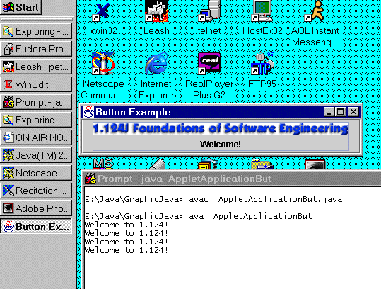
Execution of the program:
Toggle Buttons: JToggleButton
The JToggleButton class can be used to create toggle buttons, i.e. two-state buttons that can be selected and deselected. The JToggleButton class also serves as the base class for the JRadioButton and JCheckBox classes.
Check Boxes: JCheckBox and JCheckBoxMenuItem
The JCheckBox class can be used to create check box buttons, typically, to represent choices that are not mutually exclusive. Any number of check boxes in a group of check boxes, or even none, can be selected. Class JCheckBox extends JToggleButton class and implements the Accessible interface.
The JCheckBoxMenuItem class, which is a JMenuItem subclass, can be used to put check boxes in a menu.
Radio Buttons: JRadioButton and JRadioButtonMenuItem
Radio buttons are implemented in Swing using the JRadioButton class, typically, to represent choices that are mutually exclusive. Only one radio button, at a time, can be selected from a group of radio buttons.
The class JRadioButtonMenuItem, which is a JMenuItem subclass, can be used to put a radio button in a menu.
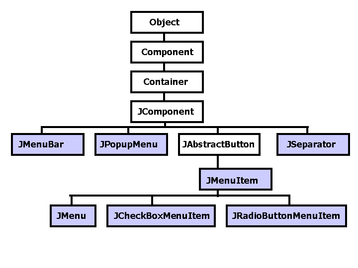
Menus: JMenu, JMenuItem, JCheckBoxMenuItem***,*** and JRadioButtonMenuItem
Swing provides components for menus (e.g. menus within menu bars and pop-up menus), and for menu items. Class JMenuItem extends the AbstractButton class and implements the Accessible and MenuElement interfaces.
A menu item, which is an instance of a JMenuItem or one of its subclasses, is essentially a button, as well as a menu is. The latter, i.e. the menu, is an instance of the JMenu class or one of its subclasses. Menu items, since they are buttons, send action events when activated. In addition, they can send MenuDragMouseEvents when a mouse is dragged over them, and MenuKeyEvents when a key is pressed, released, or pressed.
An accelerator, which offers keyboard shortcuts to bypass navigating the menu hierarchy, can be specified for menu items. A mnemonic, which offers a way to use the keyboard to navigate the menu hierarchy, is a key which is pressed in conjunction with a Meta key.
The following image (adapted from the Sun’s Swing/JFC Tutorial) presents the menu-related inheritance hierarchy:
Since a menu is a lightweight component, a component of any type can be added to it. A menu that resides in a menu bar is considered as a top-level menu, while a menu contained in a menu is considered a cascading menu.
Menus are buttons with a pop-up menu associated with them, which is displayed beneath the menu whenever the menu is activated. Items can be added, inserted, or removed from menus using the JMenu methods. The JMenu class extends the JMenuItem class and implements the Accessible and MenuElement interfaces. Components and separators can also be added to JMenu instances. Menu listeners and be added and removed from JMenu instances.
The JCheckBoxMenuItem and the JRadioButtonMenuItem classes are extensions of the JMenuItem subclass.
A menu bar, implemented by the JMenuBar class, contain a row of menus and may be used both in applications and applets. Class JMenuBar extends the JComponent class and implements the Accessible and MenuElement interfaces.
Pop-up menus are implemented in Swing using the JPopupMenu class, which is a subclass of the JComponent class and implements the Accessible and MenuElement interfaces. Pop-up menus are usually shown in response to a pop-up trigger, i.e. a sequence of events, which depends on the window system.
Labels: JLabel
Instances of the JLabel class can be used to display images and unselectable text. The JLabel class extends JMenuItem and implements the Accessible interface.
Although the JLabel and JButton classes are not related by inheritance, they have many similar methods and identical properties. A menu usually appears either in a menu bar, contains one or more menus, or as a pop-up menu, which becomes visible only when the user makes a platform-specific mouse action.
Separators: JSeparator
Separators are used to separate components or sets of components. They are implemented in Swing using the class JSeparator which extends the JComponent class and implements the Accessible and SwingConstants interfaces.
Monitor Progress: JProgressBar
Swing provides the JProgressBar class to graphically indicate to the user about how much of a certain task has been performed and how much it might take to finish. JProgressBar extends the JComponent class and implements the Accessible and SwingConstants interfaces.
However, JProgressBar and ProgressMonitorInputStream utilities can also be used to provide the percentage of a time-consuming task.
Sliders: JSlider
A slider displays a value, which is between a minimum and a maximum value, that can be changed by dragging the slider’s knob or clicking on the slider. A slider can be implemented in Swing using the JSlider class, which is a subclass of the JComponent class and implements the Accessible and SwingConstants interfaces.
Methods of the JSlider class can be used to set (major and minor) tick marks, which indicate specific values associated with the slider, and labels, which are displayed on major tick mark locations, on a slider.
File Choosers: JFileChooser
File choosers are lightweight components, instances of the class JFileChooser, that are placed in a dialog or a container providing a GUI for selecting a file or navigating the filesystem. File choosers support files only, directories only, or, files and directories display modes. Class JFileChooserextends the JComponent class and implements the Accessible interface. File choosers also support single and multiple selection.
Although a file chooser displays, by default, all files and directories, file filtering can be applied to a file chooser in order to selectively show only some certain files, e.g. based on the file type. Method setFileHidingEnabled(false) can be use to show hidden files, which by default are not shown.
File choosers can be customized in many different ways using the methods of the JFileChooserclass. They can also accommodate accessory components to show the contents of selected files, or just to make themselves fancier.
Color Choosers: JColorChooser
Color choosers, represented by the JColorChooser class, can be used to provide to users with a palette of colors and allow them to manipulate and choose a color. Class JColorChooser extends the JComponent class and implements the Accessible interface. A color chooser contains a set of color chooser panes in a tabbed pane and a preview panels that displays the selected color.
Combo Boxes: JComboBox
Combo boxes, which are implemented using the JComboBox class, contain an editable area and a drop-down list of selectable items. Class JComboBox extends the JComponent class and implements the Accessible,ItemSelectable, ListDataListener and ActionListener interfaces.
Both JComboBox and JList classes can be used to display a list of items. However, combo boxes can have an editor, while list cells are not editable. In addition, combo boxes support keys selections, while lists do not.
Lists: JList
Swing Lists, implemented using the JList class, cab be used to display a list of selectable objects, from which the user can choose. Class JList extends the JComponent class and implements the Accessible, and Scrollable interfaces. Although the JList class does not provide scrolling support, instances of JList are almost always placed in scrollpanes. An instance of the ListSelectionModel class, which is used by a list to manage its selection, allows any combination of items to be selected at a time.
Tables: JTable
Tables, implemented by the JTable class, can be used to display tables, i.e. rows and columns, of data. The user is, optionally, allowed to edit the data. A number of selection modes, e.g. column, cell and cell selection, are supported by Swing tables. Tables consists of a table header, column headers, and columns with cell values.
A package, the javax.swing.table, that contains all interfaces and classes related to tables is provided in Swing. The main Swing class associated with tables is the class JTable, which extends the JComponent class and implements the Accessible, TableModelListener, Scrollable, TableColumnModelListener, ListSelectionListener, CellEditorListener interfaces.
Almost always, a tables is contained in a scroll pane, which automatically gets the table’s header (with the column names) and puts it on top of the table. The column names remain visible even when the user scrolls down.
Trees: JTree
Trees, which are implemented by the JTree class, can be used to display hierarchical data using folders and leaf items. Class JTree extends the JComponent class and implements the Accessible, and Scrollable interfaces.
Every tree has a root node from which all nodes, which may have children themselves, descend. The user can expand and collapse branch nodes, nodes that may have children, by double clicking on them, or by clicking on the folder’s handle.
Tool Tips: JToolTip
Tooltips, which are implemented by the class JToolTip, are used to display a tip for a component. Class JToolTip the JComponent class and implements the Accessible interface. The method setToolTipText(String text) of the JComponent class is used to associate a tooltip with a Swing component.
With tool tips, strings describing the functionality of a JComponent subclass object can be displayed above it, providing help to the user of the component, whenever the cursor rests over it based on timing characteristics specified by the ToolTipManager class.
Text Components: JTextComponent, JTextField, JTextArea, JEditorPane, JTextPane, and JPasswordField
Text components display text, which can, optionally, be editable by the user. Swing provides 5 classes that are subclasses of the JTextComponent class. JTextComponent extends the JComponent class and implements the Accessible, and Scrollable interfaces.
The following figure, (adapted from the Sun’s Java® Tutorial) shows the hierarchy of the JTextComponent, which is the base class for swing text components.
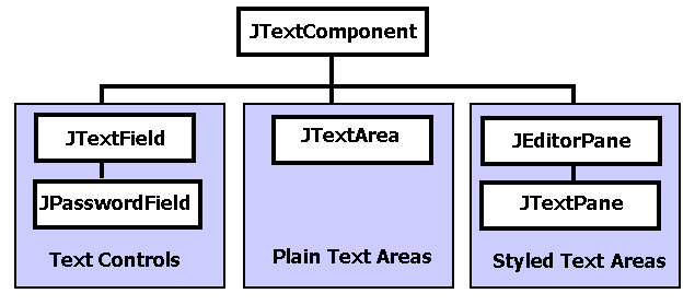
- JTextField allows the editing of a single line of text.
- JTextArea is a multi-line area that displays plain text.
- JEditorPane enables the editing of various kinds of content.
- JTextPane is a lightweight text component that can be marked up with attributes that are represented graphically.
- JPasswordField allows the editing of a single line of text while not showing the original characters.


