mit14_05_f25_chpimage_map.png
file
528 kB
mit14_05_f25_chpimage_map.png
Alt text:
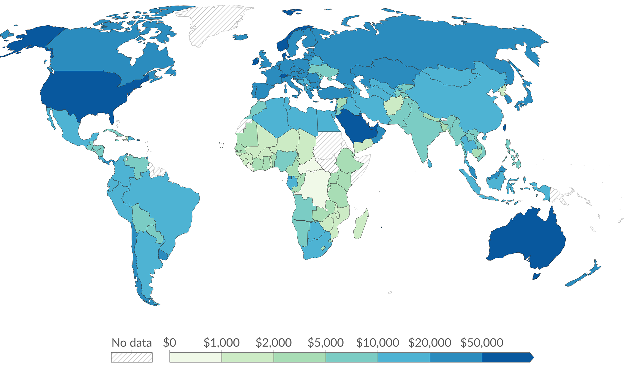
World map with countries colored in shades from light green to dark blue according to a scale ranging from no data and $0 to $50,000, with a legend at the bottom indicating economic values by region. Darker blue regions (including the United States and Australia) represent the highest values, while lighter green regions (primarily in Africa) represent lower values.
Caption:
A map showing GDP per capita in 2022, which is a country’s gross domestic product divided by its population. (Image by OurWorldinData.org. License: CC BY).
Course Info
Learning Resource Types
grading
Exams
notes
Lecture Notes
assignment
Problem Sets
assignment
Written Assignments