© Source unknown. All rights
reserved. This content is
excluded from our Creative
Commons license. For more
information, see
http://ocw.mit.edu/fairuse.
The goal of this activity is to think about how to design interfaces for learnability.
Recall the thermostat example from lecture: some people believe that you can heat a room faster by setting the thermostat to a higher temperature than you really want, as if the thermostat were a valve for the heating system that lets more heat into the room the higher you set it. In fact, the thermostat is simply an on/off switch for the heat. It turns on as long as the room temperature is below the thermostat setting, and turns off when the thermostat setting is reached.
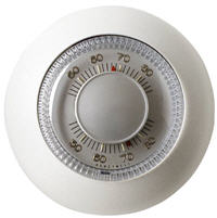
Design a thermostat user interface that communicates its conceptual model to the user more effectively, so that users are less likely to make this mistake. Sketch your idea on a whiteboard, but don’t stop with your first design. Critique it, and generate more designs. Don’t worry too much about size, cost, difficulty of installation, or other tradeoffs. Certainly don’t feel constrained by the old-fashioned thermostat design pictured at right. Be creative, and remember that we’re focusing on usability in this class.
A few things to think about:
- Would it be enough to just print an explanation on the thermostat? If so, what exactly would it say?
- A sink faucet is normally a valve, so turning it farther will make the sink fill up faster. Suppose you came across a sink faucet which was just an on/off switch. As a user, how could you tell right away?
- Suppose you think you have a good design. How, specifically, would you test it?


