
Quick Question
In this quick question, we’ll ask you questions about the following plots. Plot (1) is the heat map we generated at the end of Video 4. Plot (2) and Plot (3) were generated by changing argument values of the command used to generate Plot (1).
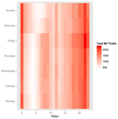
Plot (1)
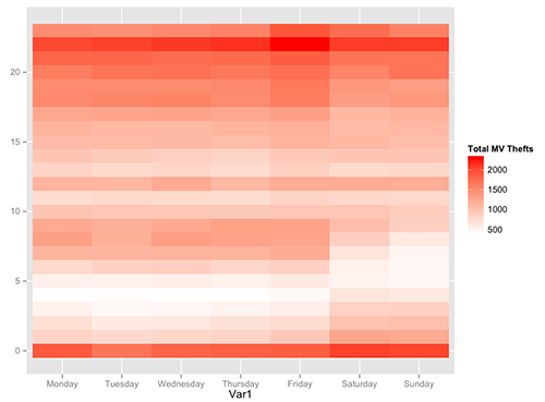
Plot (2)
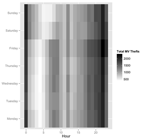
Plot (3)
Which argument(s) did we change to get Plot (2)? Select all that apply.
Explanation To get Plot (2), we changed the arguments "x" and "y" (we flipped them). Plot (2) can be generated with the following code: ggplot(DayHourCounts, aes(x = Var1, y = Hour)) + geom\_tile(aes(fill=Freq)) + scale\_fill\_gradient(name="Total MV Thefts", low="white", high="red") + theme(axis.title.y=element\_blank())
Which argument(s) did we change to get Plot (3)? Select all that apply.
Explanation To get Plot (3), we changed the argument "high" to "black". Plot (3) can be generated with the following code: ggplot(DayHourCounts, aes(x = Hour, y = Var1)) + geom\_tile(aes(fill=Freq)) + scale\_fill\_gradient(name="Total MV Thefts", low="white", high="black") + theme(axis.title.y=element\_blank())


